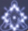
canveyboy wrote:ok....here is my first attempt.....
wow I wasnt expecting much from this design idea.but 2 great ones already.
this would be a tough call for me if this were put to the poll.
its nice and dark and mysterious looking.
Liked a lot the last 'no-arrow graphics' by canveyboy (thus, his 2nd attempt I think). Arrows seem to me only I'm with stupid-wise meanwhile neons and victorian flavour is all Fundamental era.
As has been advised before I'd rather like the legend "I like...as home" in one single sentence. And 'PSB' same size font at least
Just give me time!!!
I'll do that.
What do you want to see on the banner?
I think it is not good to make black banners, becouse balck is not super happy color.
Just give me the week, I hope the competition will not finished before 22 may.
Yep, we need to be wary of too much black. The forum colours can't be turned to black to go with the graphic because it'd make the whole forum look creepy and unwelcoming.
Like I said, I know the press shots ATM are very 'black', but some artistic licence is required to ensure the whole graphic isn't black.