The subtle differences between various single sleeves
Posted: Fri 13 Mar 2026, 4:28 pm
Let me first admit: I am a sucker for PSB sleeves and their artwork. They have been almost as important as their music and lyrics to me as a fan and collector.
A long-term project of mine is to digitize all my 12” and 7” records. This project also involves scanning all the front sleeves and then editing the images to remove minor defects etc. This is what made me discover some interesting subtle differences between the sleeves of the UK/European releases of “Always on my mind”, and later the ones of “Heart”, respectively.
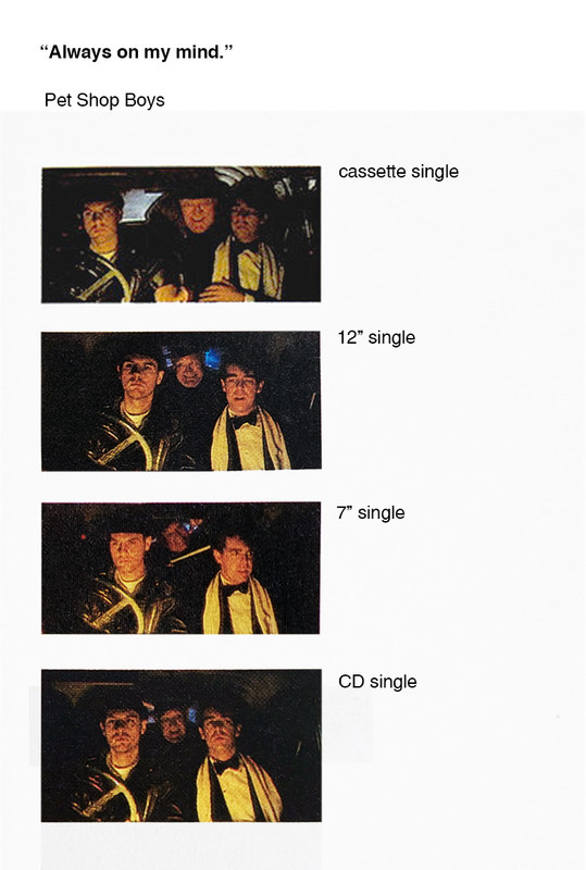
I have always assumed that the tiny still photo on the UK/European 7”, 12” and CD single of “Always on my mind”, taken from the movie “It couldn’t happen here”, were all the same. But no, they are all different, as shown in the comparison below.
With “Heart” it gets even more interesting. We all know that both the UK/European 7” and 12” came with two alternative sleeve designs – one showing Chris and the other showing Neil. We also know that (as explained in “Catalogue”) the 7” sleeves were printed with a brown tint, while the 12” sleeves were made blue. I have always thought that apart from that, the 7” and the 12” with Chris and the 7” and 12” with Neil used the same photos. But no! Looking closely, these are all different photos from the same shoot, clearly visible when you look at how they hold their hands.
Moreover, the sleeve of the 12” remix of “Heart” combines a sitting Neil and a standing, blurry Chris, using a brown tint, while the CD single shows the same combination but with a blue tint. But again, these are two different photos. At first, I thought that just Chris in the background was different, but looking more closely, Neil is also different, if ever so slightly.
Maybe this has been discussed at length before, but for me this is a recent discovery, giving me another justification for owning all these releases. Maybe there are more examples of such subtle differences between the various formats of other singles?
/Galex
A long-term project of mine is to digitize all my 12” and 7” records. This project also involves scanning all the front sleeves and then editing the images to remove minor defects etc. This is what made me discover some interesting subtle differences between the sleeves of the UK/European releases of “Always on my mind”, and later the ones of “Heart”, respectively.
I have always assumed that the tiny still photo on the UK/European 7”, 12” and CD single of “Always on my mind”, taken from the movie “It couldn’t happen here”, were all the same. But no, they are all different, as shown in the comparison below.
With “Heart” it gets even more interesting. We all know that both the UK/European 7” and 12” came with two alternative sleeve designs – one showing Chris and the other showing Neil. We also know that (as explained in “Catalogue”) the 7” sleeves were printed with a brown tint, while the 12” sleeves were made blue. I have always thought that apart from that, the 7” and the 12” with Chris and the 7” and 12” with Neil used the same photos. But no! Looking closely, these are all different photos from the same shoot, clearly visible when you look at how they hold their hands.
Moreover, the sleeve of the 12” remix of “Heart” combines a sitting Neil and a standing, blurry Chris, using a brown tint, while the CD single shows the same combination but with a blue tint. But again, these are two different photos. At first, I thought that just Chris in the background was different, but looking more closely, Neil is also different, if ever so slightly.
Maybe this has been discussed at length before, but for me this is a recent discovery, giving me another justification for owning all these releases. Maybe there are more examples of such subtle differences between the various formats of other singles?
/Galex